(You can refrain from reading all the musings and scroll down straight to Printing section.)
It must have been some 10 years ago when I bought my first inkjet printer. Back then, influenced by the ad campaign of easy home printing of photorealistic pictures, I acquired the early Epson R200. Few ink tanks it had, maybe 4, that were supposed to guarantee correct colors. I used them up quickly with results that were galactic miles away from what I saw on my screen. No chance to get even close.
And worse, the same image was rendered differently each time. I must have been doing something terribly wrong, but I never figured out.
Tearful and hopeless, I did not even dare to try to sell the dysfunctional machine. I threw it to the bin and let it be there for a very long time. My confidence in the inkjet printing dropped to nil and I slowly walked my files back to the nearest minilab that could not remove the greenish cast from any of their jobs.
It’s clear now that I was too fast in attempting to adopt the evolving technology for home use. The thing that is called color management was completely absent in the entire process. The hardware was not up to reproduce a full color range on the input.
Nowadays, the situation is fundamentally different. Over years, inkjet printer manufacturers developed their products and drivers to the extent that it is now able to respond reliably to any data that is communicated from a computer. They feature some seriously advanced ink distribution systems and count 10+ ink tanks, technically speaking. ;-)
Even more, we perhaps got to the point that the technology does not seem to be going anywhere anymore (if I’m not missing something). It is just growing bigger and getting more affordable.
Having said that, I’m able to do all my fine art printing work at home with (almost) no compromise. I will show you today how simple it is to achieve consistently predictable results with tools and software you are probably utilising anyway. The only reason why I say 'almost' is that I think RIP (raster image processing) software that I currently don’t use could lift the quality of my printing output higher. The question-mark remains over the cost of RIP vs incremental quality improvement.
Example: one of the best and most accessible RIPs Imageprint from Colorbyte for Epson 3880 costs $895 while the printer itself is sold at $1,129 in B&H. If you are a complete-super-top-quality-prints junkie who is crazy rich, you may wish to go for it.
Otherwise, all you need is this:
1. Printer
Everything I have ever done with printing was on Epson. The Stylus Pro 3880 has been used for the purpose of this article. It is a great machine with 10 inks and A2+ size capabilities. But I'm sure you will be just fine with Canon or HP. I'm not too familiar with other brands, to be honest.
2. Paper
I love inkjet paper. It's a piece of art in what's otherwise a pure technocratic world. There are plenty of various producers that offer vast types of paper and canvas. Experimenting with the paper is perhaps the most enjoyable part of the process. I generally prefer to print on lustre finish - I like its thickness and aesthetics of the surface. It lacks the glare of glossy material and still well resembles a silver gelatine paper. Having tried lots of different papers, I ended up using Crane Museo Silver Rag for its beautiful structure, a decent warmish rendition and for just-about-right gloss. Hahnemuhle is also offering a very interesting range of papers to fit your taste. Photo Rag 308 and Photo Rag Baryta are great papers for landscape photography.
3. Software
As I mentioned above, you may want to consider RIP, but I believe you will be almost as good with Photoshop. I don't have an experience with any other software.
4. Image to print
You definitely need it, but with your permission, I will not talk about how to prepare an image for printing in this post. I only say your usual post-processing standards appear with focusing on the right balancing of colours and sharpening. Make sure your resolution remains at least 300 dpi. Happy to answer any questions on this and maybe I will put together a brief article about it, too.
5. This post
So if you have any Epson Stylus, any fine art paper, Photoshop, an image to print and you want to learn or just double-check your process, read on. I'm making it as simple as possible so allow me to be a little loose here and there.
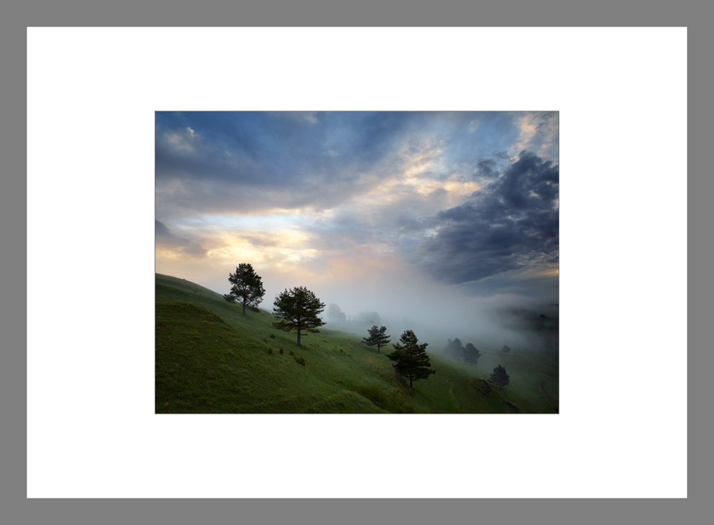
Web version of the input. Colour managed, soft-proofed and then printed as demonstrated below.
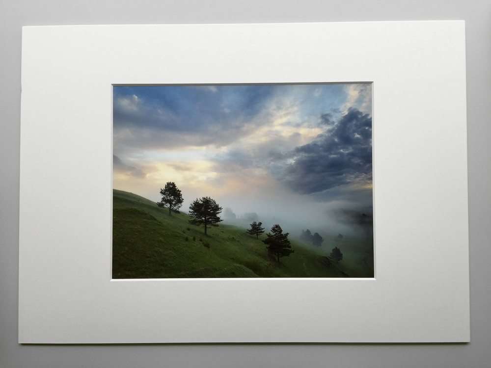
The matted print of the above original shot by uncalibrated iPhone. Comparing the print with the original file on my display shows very small differences in colour when viewed on daylight. Uneasy to demonstrate here, but I'm sure you get the idea.
Colour management
Before we get to work on our prints, it is important to set up colours. Colour management is indeed a very scientific discipline, but let me just scratch a little of the surface for the purpose of this post. Colour management ensures consistent appearance of colours across multiple devices so that the good match is achieved from input to output. This is done through employing a colour profile (ICC) for each device in your workflow chain (camera/scanner, display, printer). Then, the standard algorithms (CMM - color matching method / module) are used that render destination profile colours from a source profile.
So, you will need to do couple of simple things. I'm sure you always shoot RAW and use ProPhoto RGB or Adobe RGB colour space in your RAW converting software (avoid sRGB as this is very brief gamut compared to the two). You may want to create a profile for your camera, but in my view it's not that important as you will be anyway tweaking colours during post-processing. What is important, however, is to calibrate your display in order to ensure that it renders colours as close to your processed file as possible.
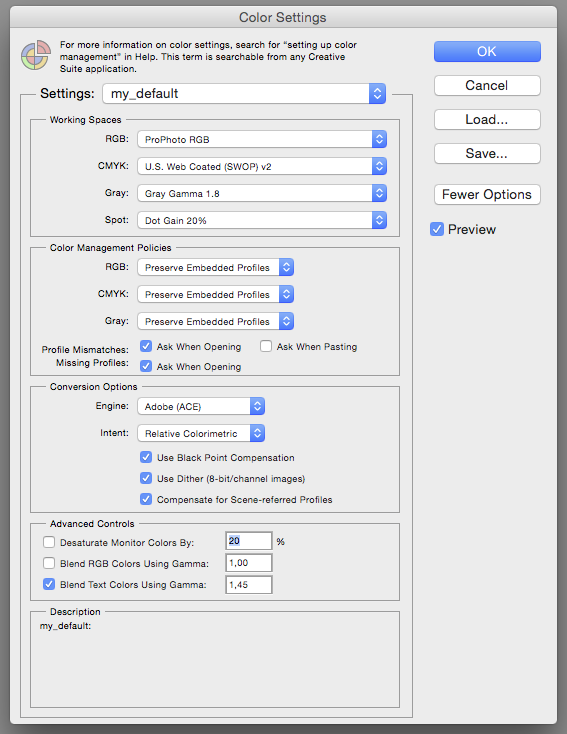
Next look at your setting in Photoshop. Go to Edit -> Color Settings and check your Working Space settings: RGB should read ProPhoto RGB or Adobe RGB for the widest gamut.Here's how my default settings look like:
Now, the last thing is to prepare profiles for the printer. They define how a printer will render colours on a certain papers. There are couple of options how to go about it. The quickest and dirtiest is to download from a paper manufacturer website. Remember, you will need one for each paper you intend to use, designed specifically for your printer type. I have been using those for years with excellent results. You can also buy custom profiles from a third-party company or, if you like to have a full control over the process, you may want to consider making your own profiles (requires spectrophotometer and related profiling software).
Soft Proofing
I think we are now good to go on. I assume your files are resized for the actual size of the output, have the resolution of 300 dpi (Canon output resolution) or 360 dpi (Epson) and are sharpened for printing (Photokit Sharpener does amazing job). Soft proofing will tell you how much of your colours can be reproduced by your printer on a specific paper. It is important to understand this and perhaps make adjustments to the image. The process transforms an image to ICC profile of your printer / paper combination and subsequently shows it through your display profile. This way, you can see how your final print will look like. When I printed on lightjet printers, I used to use this for understanding how much of my colours would be clipped off. Fuji Crystal Archive, for example, did not like certain hues of morning red light. Instead of just letting the lab to clip off with no control, I tried to recreate a similar colour in my post-process; under soft proof profile.
To soft proof an image in Photoshop, go to View -> Proof Setup -> Custom and choose the profile for your device / paper combination and the rendering intent, choose the one that pleases your eye more. As simple as that, your image is soft proof. You can now assess the contrast, the appropriate ICC profile for output and choose the best rendering intent.
Printing
If you managed to have read to this point, thank you. If you managed to follow and check out / implement the above advices, congratulations. You are ready to print beautiful images that will look like what you see on your screen.
We will print for Photoshop (File -> Print). Print settings dialog is where we start:
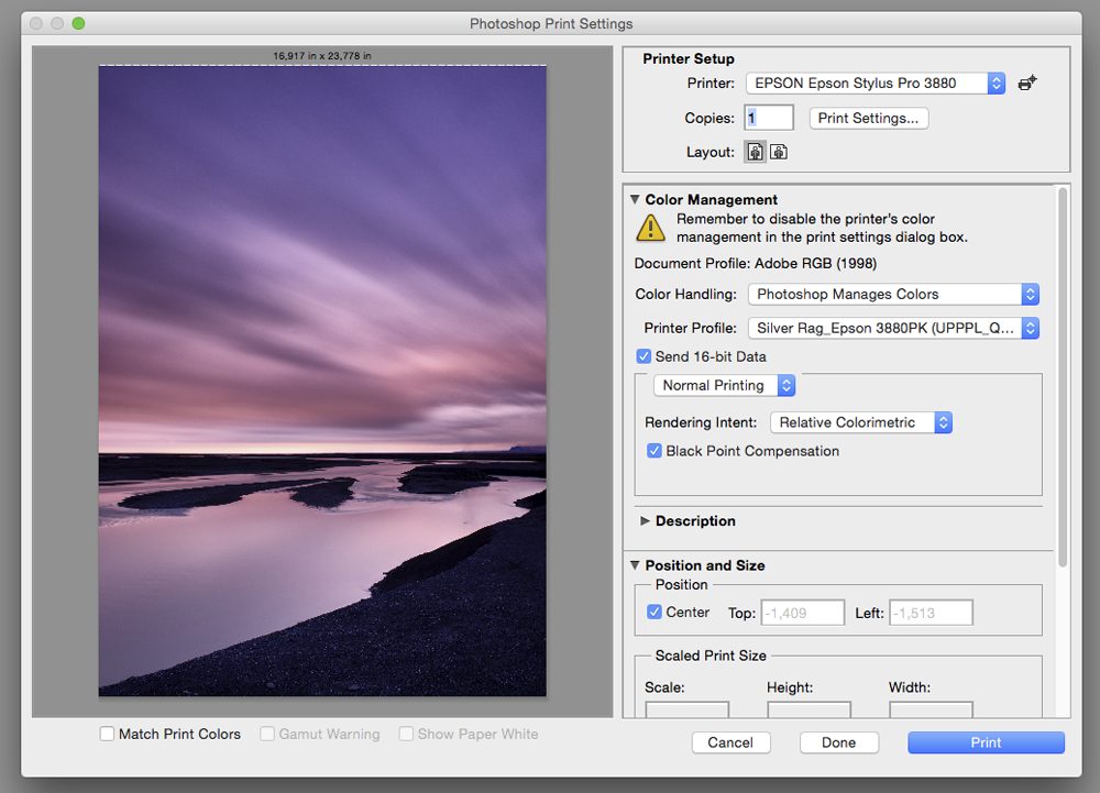
First, select the printer and the layout. Print Settings is the important button, which takes you to setup of your printer. I talk about it 4 paragraphs below.
Second, color management panel. For colour printing, you will want Photoshop to manage colors. Assign the profile for the printer (this one has been downloaded from Crane Museo website and works perfect). Send 16-bit data and choose normal printing. Now, the rendering intent depends on soft proofing results (see above). Compare the two: Relative Colorimetric or Perceptual and choose one that fits you better. And then check Black Point Compensation as it maps the black point of the image to a paper black.
Position and Size is self-explanatory and I don't use anything else in this dialog.
The three options on the left bottom side (Match Print Colors, Gamut Warning, Show Paper White) are basically soft-proofing tools, but in this dialog, it's too late to do anything with it except for double-check how your print would look like. Do soft-proofing in Photoshop as described above.
Now, after you click on Print Settings button from Printer Setup area, this is what you get:

Choose you paper size depending on what you plan to print on. I don't do anything with Layout, Color Matching, Paper Handling, Cover Page. Printer Settings is very important in here:

You can play with Page Setup if you don't feed the printer manually as I do. I'm sure you will understand all the options, maybe after a little bit of trying. Media Type will reflect the paper you are using. Make sure you choose properly as you might end up printing with an incorrect ink. The Ink (Photo Black or Matte Black) will come up automatically after you select media type.
As we asked Photoshop to manage colours, Print Mode and Color Mode are dimmed. I always check 16 Bit Output box, although I doubt I would see the difference. I do the Output Resolution as high as possible to be on a safe side. For some material like canvas, there will be no difference if you choose 1440 dpi. My testing of Crane Museo Silver Rag has shown very subtle enhancement of quality when I went with 2880 dpi and Finest Detail (unique to Epson - it actually makes the printer driver preserve the best detail that is physically possible). It also all depends on the material and viewing distance. Canvas to be looked from 2 meters can be printed with 720 dpi, high speed checked and finest detail unchecked. Your print will be ready considerable faster. As I want to achieve the highest quality possible, I almost always print with the above (maximum) setting. My beautiful prints on Crane paper thank me for this.
Done. Save. Print. Have fun.
And don't forget to give your prints a treat afterwards. Coating, matting, signing, framing, storage add a lot to them. There are hundreds ways of doing some or all of this.
(Disclaimer: This article involved Epson Stylus Pro 3880, Adobe Photoshop CC, Crane Museo Silver Rag. For other machines, softwares and papers, the settings and screens would be similar. Lastly, this article describes color printing. I have no experience with black and white, but I'm sure Ota will address all the questions as he used to be the BW printing master before he went to the true darkroom.)